The Art of colour Contrast in Interior Design

The Art of Colour Contrast in Interior Design
Colour is one of the most powerful tools in interior design. It sets the tone, creates mood, and even affects how we feel in a space. But beyond simply choosing a favourite palette, the magic really begins when contrast comes into play. Colour contrast is what gives a room depth, energy, and personality. It's the secret ingredient that makes a space feel dynamic rather than flat.
What Is Colour Contrast?
In simple terms, colour contrast is the visual difference between two or more colours. The greater the contrast, the more the colours stand out from one another. This can be achieved in various ways — through hue (the actual colour), value (lightness or darkness), and saturation (intensity).
For example:
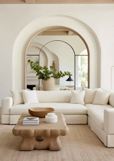
High contrast: black and white, navy and coral, or emerald green and gold.
Low contrast: soft beige with light grey, or pale pink with ivory.
Why Colour Contrast Matters in Design
Colour contrast does more than catch the eye — it shapes the way we perceive a room.
1. Adds Visual Interest
A room filled with similar tones can feel monotonous. Introducing contrast — like pairing a navy-blue sofa with mustard yellow cushions — creates focal points and visual excitement.
2. Defines Spaces
I open-plan areas, colour contrast can help define zones without using walls. A deep-colored rug beneath a dining table can separate it from the adjacent living area, even if both are part of the same space.
3. Enhances Mood
Light and dark contrasts can impact how a space feels emotionally. High contrast (like black and white) tends to feel more dramatic and modern, while lower contrast (like soft blues and greys) creates a calming, harmonious vibe.
4. Improves Functionality
Good contrast isn’t just aesthetic — it can also be practical. For example, contrasting colours between walls and floors or between furniture and flooring help people (especially those with visual impairments) move safely through a space.
How to Use Colour Contrast Effectively
Here are some practical tips to bring contrast into your interiors without overwhelming your space:
✔ Start with a Base
Choose a neutral or subdued base colour for large surfaces like walls, floors, or sofas. This gives you a versatile backdrop to layer in contrast without chaos.
✔ Add Accent Colours
Introduce bold or rich colours through accents like cushions, artwork, throws, and lamps. This creates contrast without the commitment of repainting walls.
✔ Balance Warm and Cool Tones
Contrast isn’t just about light and dark — it’s also about temperature. Try pairing cool tones like blues and greens with warm shades like rust, terracotta, or gold to add vibrancy.
✔ Use the 60-30-10 Rule
This classic design principle suggests using:
60% of a dominant colour (e.g., walls, large furniture),
30% of a secondary colour (e.g., rugs, curtains),
10% of an accent colour (e.g., accessories or statement pieces).
It helps maintain balance while still incorporating contrast.
✔ Don’t Forget Texture
Contrast can also be created through materials and finishes — think matte vs. glossy, soft fabrics against hard wood, or smooth leather with rough linen.
Common Mistakes to Avoid
Too much contrast: Overloading a space with clashing colours can feel chaotic. Use contrast with intention, not for the sake of it.
Ignoring undertones: Two colours may technically contrast, but if their undertones clash (like a cool grey with a warm beige), the result can feel disjointed.
No place to rest the eye: Not every corner needs a pop of colour. Include some neutrals or calm spaces for visual balance.
Final Thoughts
Colour contrast is a design strategy that can transform your interiors from bland to bold — or from flat to sophisticated. Whether you're going for drama, elegance, or subtle harmony, learning to play with contrast gives you creative control over the look and feel of your space.
So, next time you're planning a room refresh, don’t just think about your Favorite colours. Think about how they interact. That’s where the true magic of design lies.
💌 Want to book a session or ask a question?
📞 Call/WhatsApp: 0796109572
📧 Email:rkadmala@gmail.com

This comment has been removed by the author.
ReplyDeleteThe color will always define everything
ReplyDeleteAmazing
ReplyDelete"Love this post! 🌟 The examples of high and low contrast color schemes are really helpful. Can't wait to apply these tips to my own design project!"
ReplyDelete"How do you recommend balancing bold, contrasting colors with neutral elements in a room?"
ReplyDelete🎨 Balancing Blonde: Contrasting Color Palette with Neutral Harmony
DeletePrimary Palette: Blonde Tones (Light Woods & Creams)
Blonde Wood: Think oak, birch, or ash—light, warm, and natural.
Cream or Off-White Walls: Adds softness and reflects natural light beautifully.
Light Linen Upholstery or Rugs: For an airy, tactile base.
These create the warm, sun-kissed backdrop of your space.
The design element is fabulous plus it brings out such a beautiful transformation.
ReplyDeleteFirst of all its amazing because yellow is my favourite plus it`s actually giving and it looks beautiful
ReplyDelete